Skip to content
Creating a market-leading identity for a fintech company, rooted in human connection and accessibility
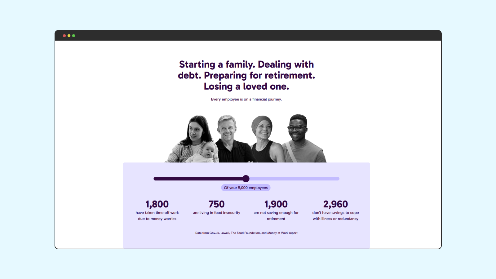
Bippit's tackling financial inequalities by providing expert financial guidance to every employee.
Goal: Expedite the rebrand and website launch to capitalise on market opportunity
Outcome: Initiated and executed a comprehensive rebrand and new website in just 5 months, over twice as fast as the industry average.
Goal: Rebrand Bippit to position it as a leader in the fintech benefits space
Outcome: The increased market presence from this rebrand resulted in multiple six-figure business deals. Its accessibility also contributed to the biggest deal in company history.
Goal: Create a more accessible, engaging, and unique brand identity
Outcome: Launched a cohesive new brand and website that achieved WCAG AA/AAA accessibility standards.
Read how Meika did it
Let’s be honest: finances can be boring, and the old Bippit brand was no exception. The issues were clear: a lack of strategic foundation, dense and confusing copy, and visuals that were uninspiring and stereotypical. The brand didn’t reflect its expert-led, human-centered service, and it failed to connect with users on an emotional level.
We saw this as an opportunity to transform the Bippit brand, making it as dynamic, expert, and human as the service itself. We created a brand that stands out by focusing on what truly matters: people and the conversations that change lives.
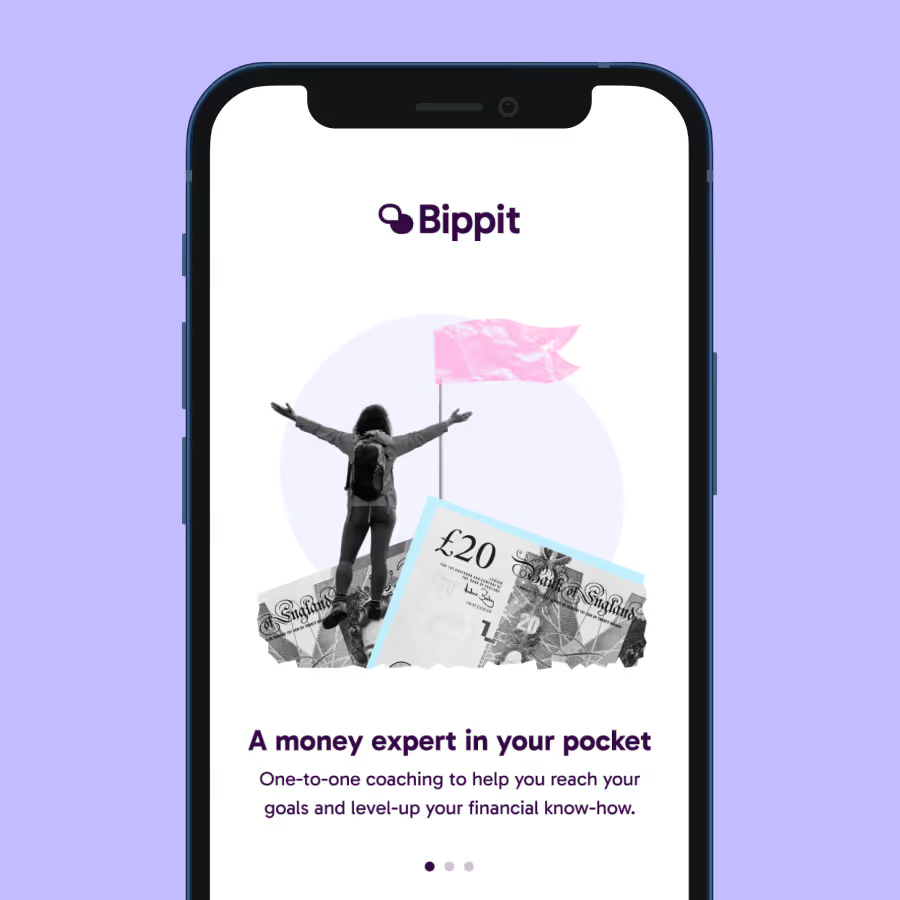
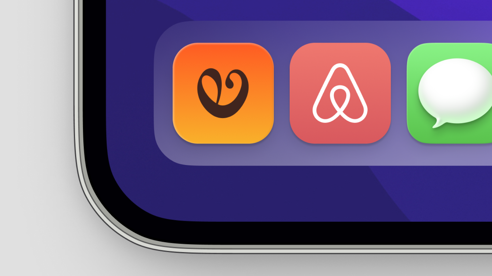
- A human-centered logo: Our new logo uses two overlapping chat bubbles to symbolise the core of Bippit: expert-led conversations. The geometric yet rounded shapes balance professionalism with an approachable, friendly feel.
- A purposeful visual sstem:
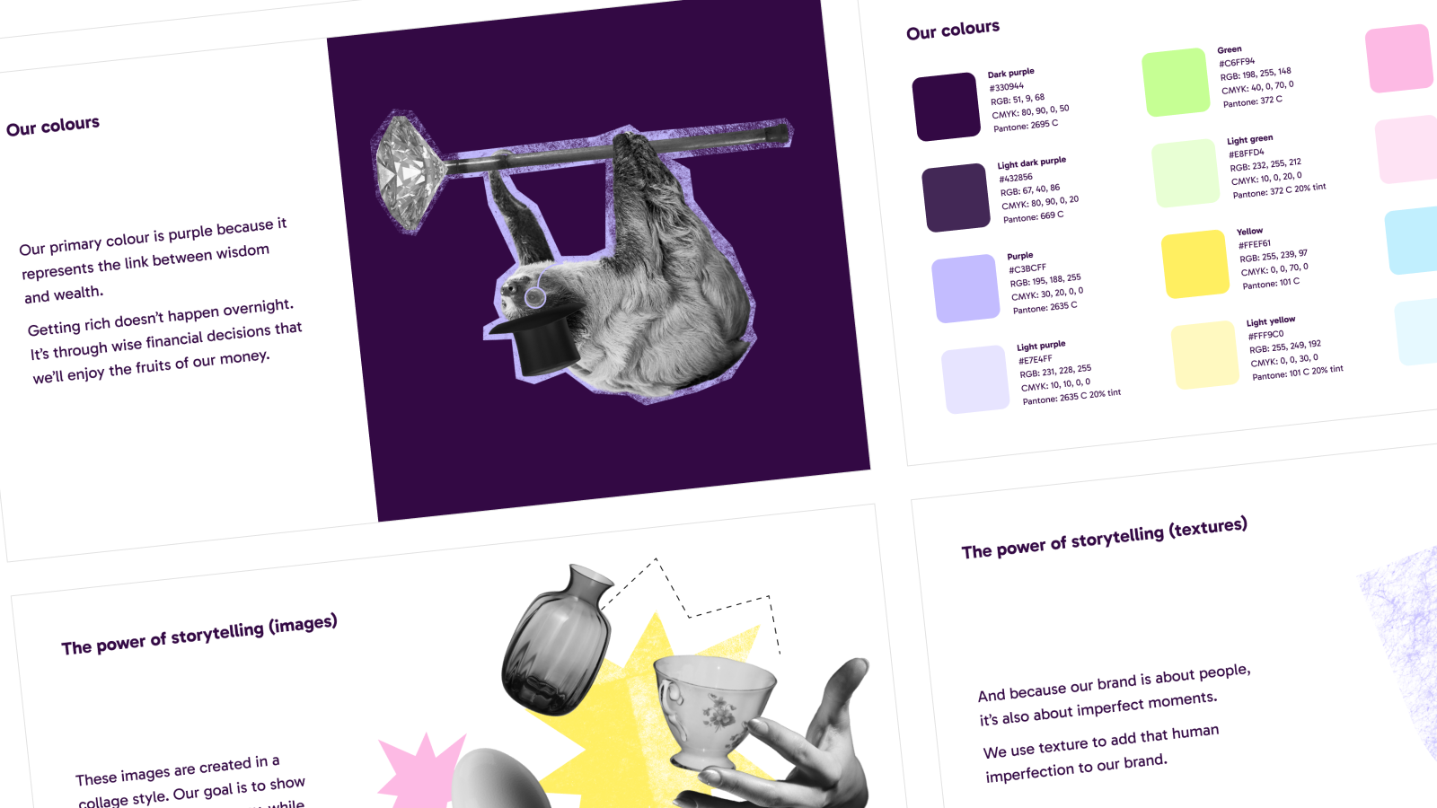
- Colours: We developed a refreshed palette inspired by the shades of money from around the world, symbolising the diverse conversations we have about finance. These colours also meet the highest accessibility standards (AAA).
- Typography: The new font, Gabarito, was chosen for its clarity and purpose. Originally designed to help students prepare for university exams, it represents the guidance our expert coaches provide to help people navigate life’s financial challenges. It’s also dyslexia-friendly, ensuring our content is accessible to all.
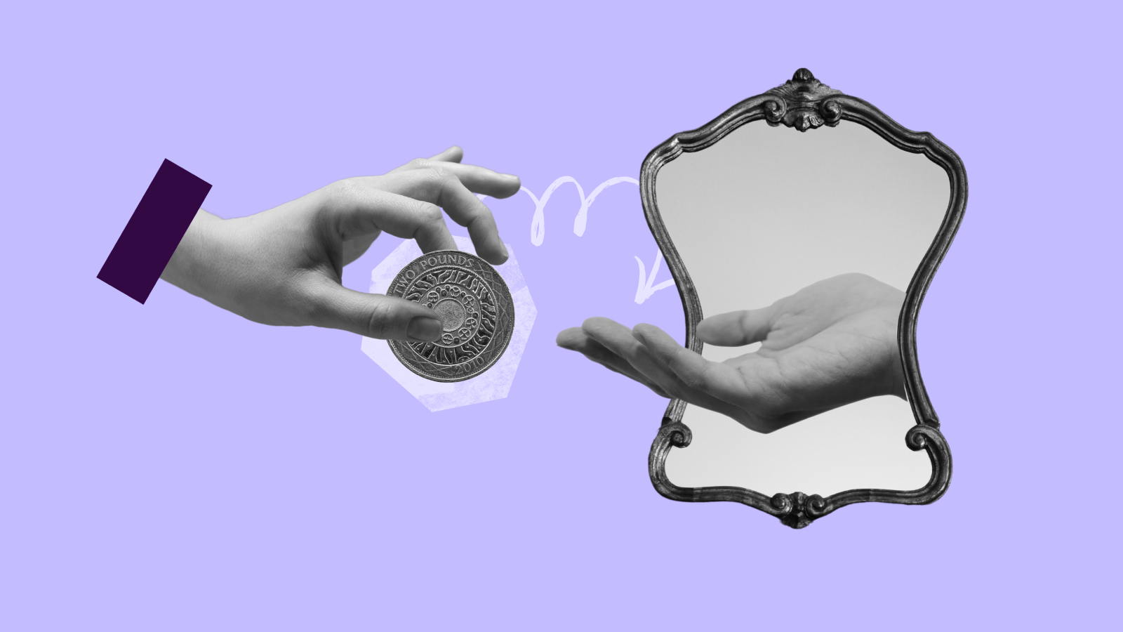
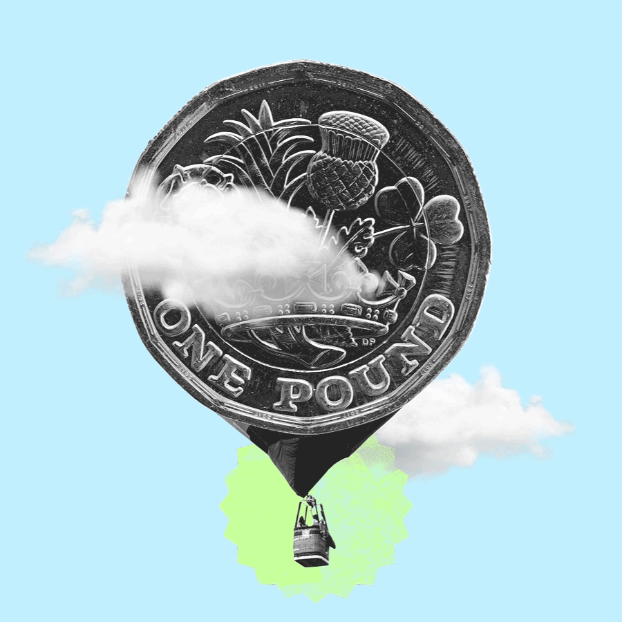
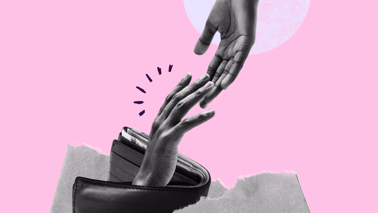
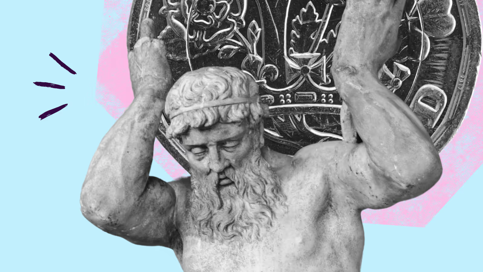
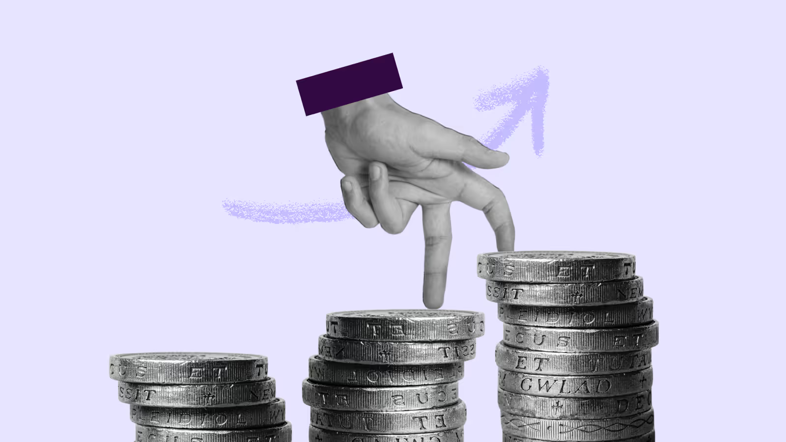
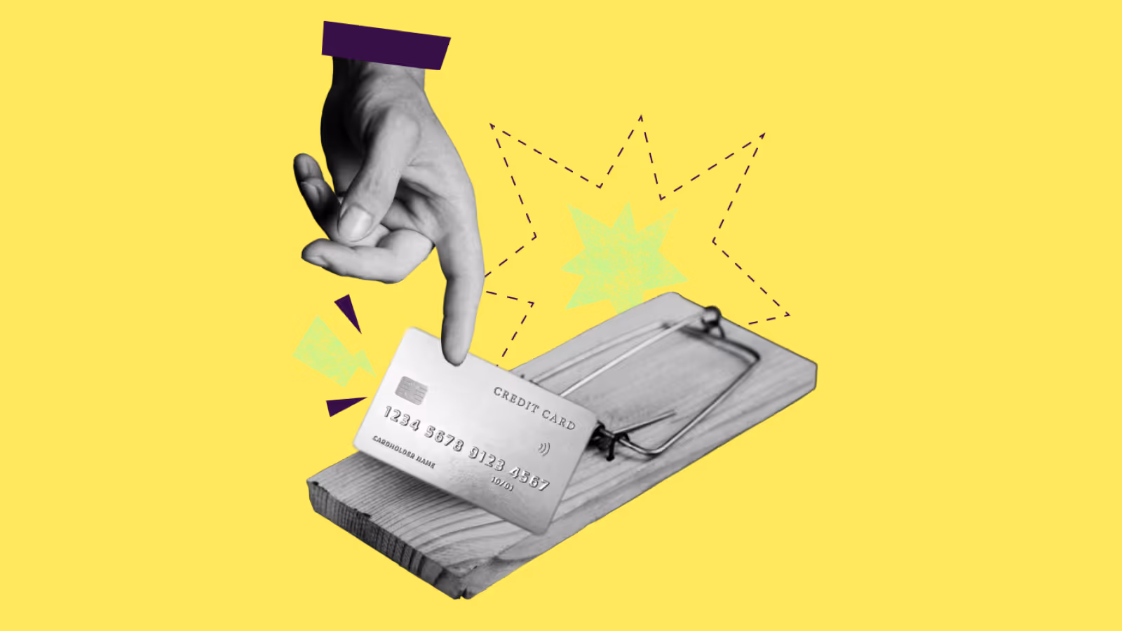
- Imagery: We moved away from generic stock photos. Our new imagery uses a collage style to blend personal moments with financial journeys, bringing a human touch to an often intimidating topic.
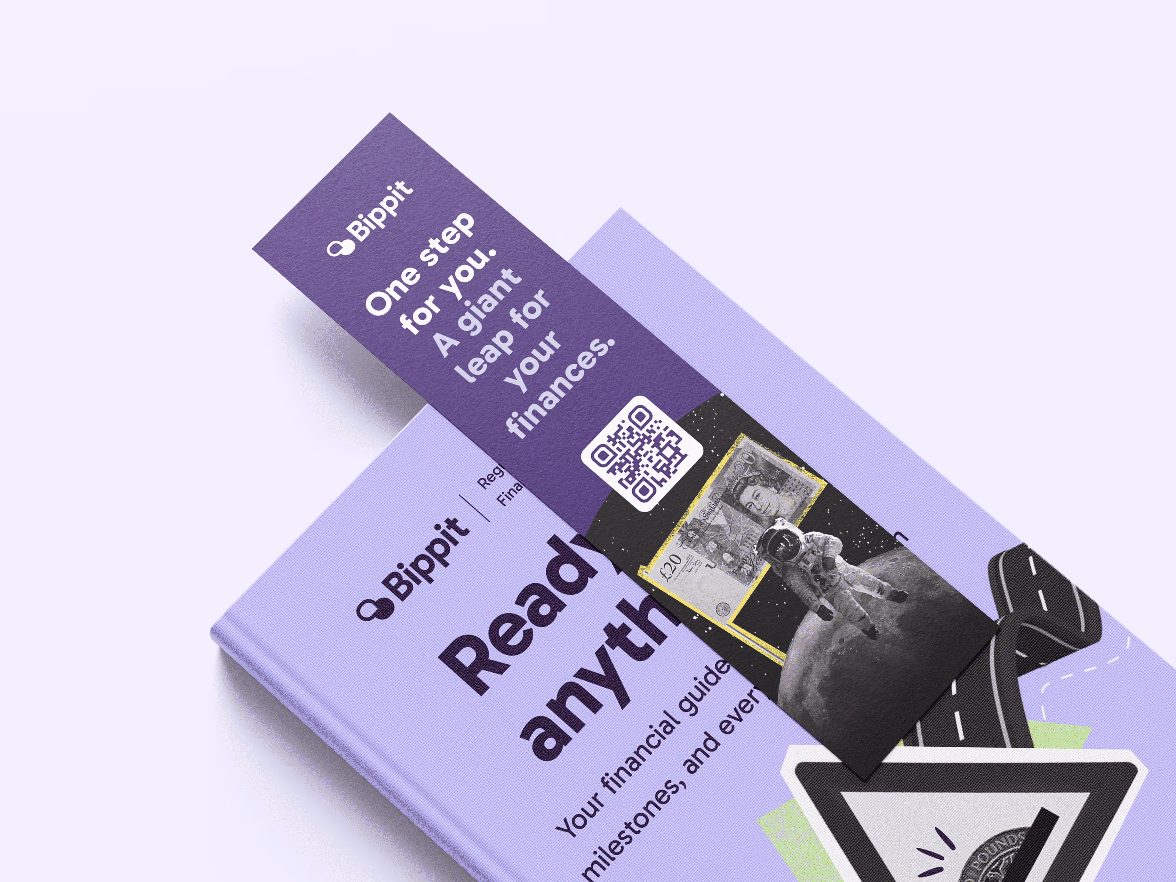
- An accessible website: A cornerstone of our rebrand was a complete overhaul of the website. We rebuilt it from the ground up to follow WCAG 2.1, Level AAA guidelines.
The result is a brand that not only looks great but also works better for everyone, proving that financial wellbeing can be approachable, clear, and truly human.


Before
After


Before
After

Sweet dreams are made of these case studies
Dive into the projects where strategy meets design to solve real business challenges.
See all case studies


"Her designs consistently deliver results and integrate into the overall business strategy."

Like what you see?
Let’s spend 30 minutes discussing your goals and see how we can bring your vision to life.
Work with meDream Retainer
Dream Project
Why Meika
Portfolio
Privacy policy
Accessibility
Brand and website by Meika. Built from scratch, because dreams don't come in templates ;)
Meika
First Floor, Swan Buildings
20 Swan Street
Manchester
M4 5JW