Skip to content
Since my work for a healthtech startup remains confidential, I built this fictional brand to show you how I think and design. This project mirrors the real-world requirements, challenges, and variety of assets generally found in the industry.
Designing a trusted space for women’s health where personal data is never for sale
Nishe is normalising the conversation around periods by giving women the tools and the privacy they deserve to understand their own bodies.
While the brand name is fictional, the goals and outcomes listed below are 100% real and taken from my actual work in the industry.
Goal: Deliver high-impact design with speed and precision
Outcome: Working with me meant that we reached the final approved design faster than typical design workflows by delivering high-accuracy initial concepts. This meant that time used in feedback rounds was reduced by 90% and 100% of deadlines were met.
Goal: Support investment efforts
Outcome: Partnered with the C-Suite to design and develop mission-critical presentations that contributed to the successful closure of a $45 million Series B funding round.
Goal: Make complex medical information accessible
Outcome: I translated complex health data into user-friendly visuals and guides. By working closely with medical experts, I ensured every asset was both scientifically accurate and easy to understand.
Read how Meika did it
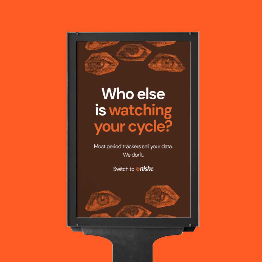
Managing reproductive health is deeply personal, yet most period-tracking apps treat users like data points rather than people. Many of these apps have faced criticism for selling private user information, leaving women feeling exposed. The challenge was to create a brand for Nishe that felt medically reliable but radically private: breaking taboos while keeping user security at the forefront.
We saw an opportunity to build a brand that empowers women to own their bodies and their data. By combining "human" aesthetics with "tech-forward" security, we created a space where health conversations are both normal and protected. This is how we achieved that:
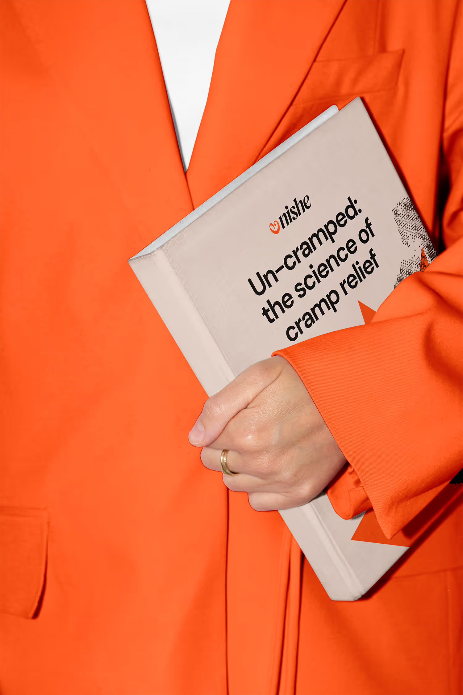
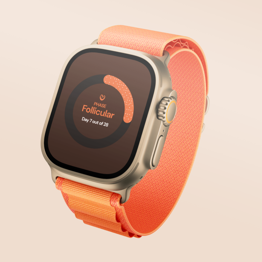
- A "human-first" colour palette: Instead of the typical pinks often seen in femtech, we used a palette inspired by real people. We combined skin-toned creams and browns with a bold orange to represent periods. This choice moves away from stereotypes and makes the brand feel inclusive and grounded in biology.
- Privacy-first messaging: We tackled the industry's biggest "trust gap" with direct, bold copy. Our headline, "Your body. Your data. Period.", clearly communicates that Nishe will never sell user information, turning a complex legal promise into a powerful brand mission.
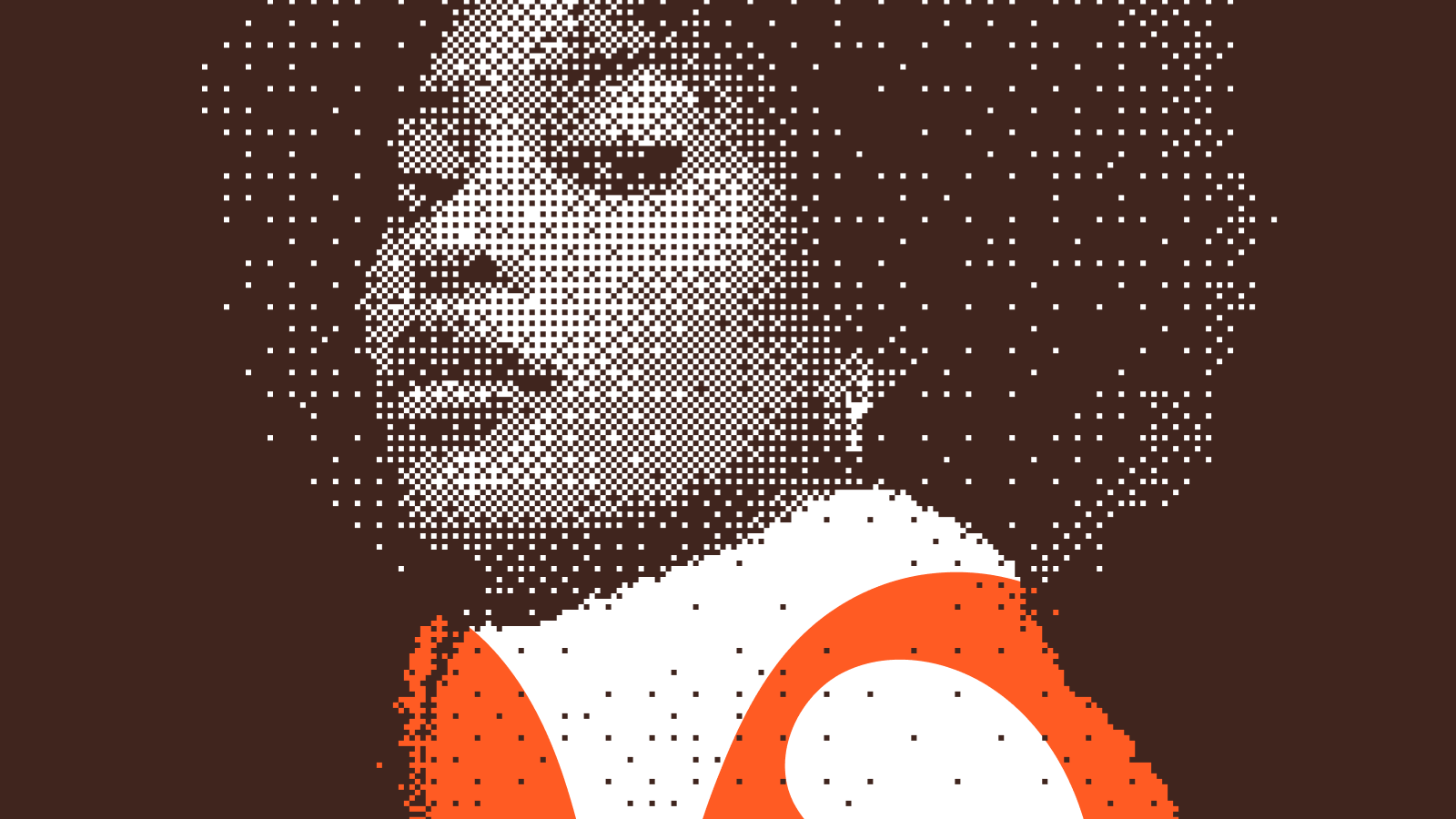
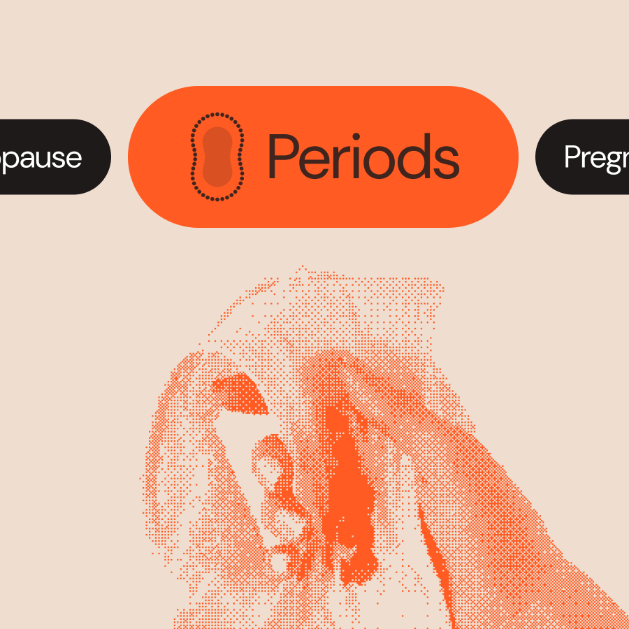
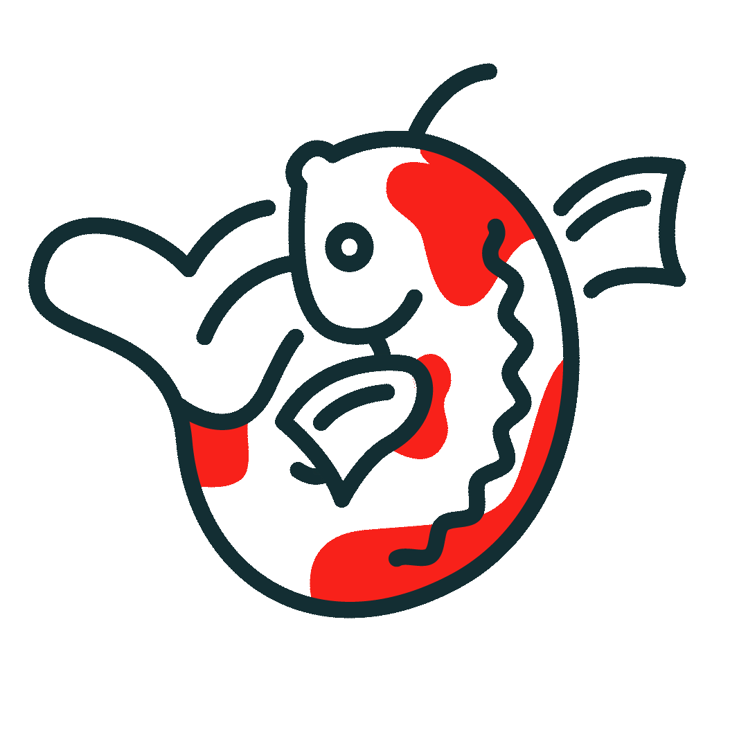
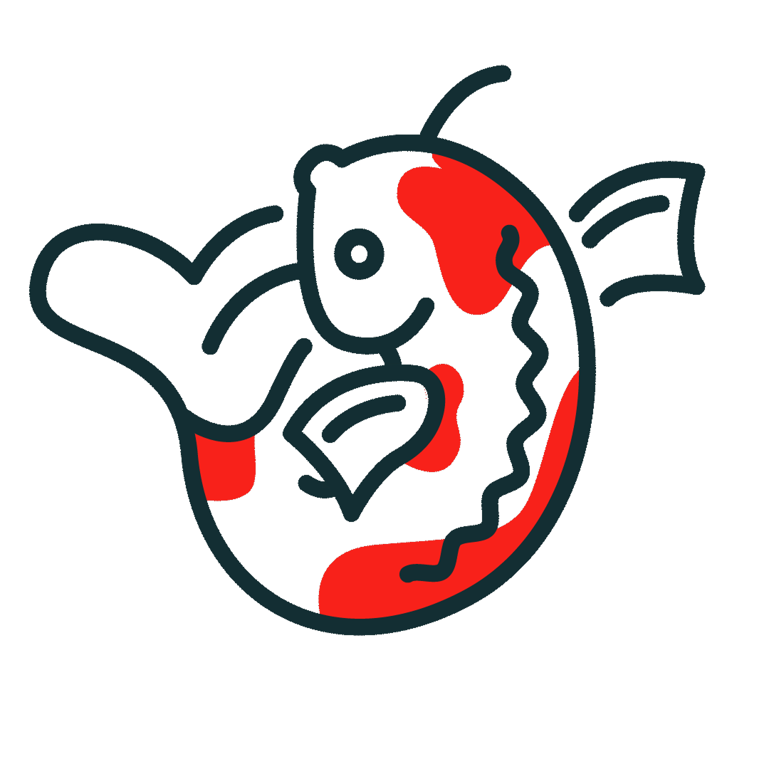
- The "pixel art" visual style: To balance the "human" and the "tech," we used imagery treated with a pixel art effect. While pixels represent the digital security of the app, pixel art is a handcrafted style. This symbolises that while the platform is high-tech, it is built by humans, for humans.
- Breaking taboos with honest imagery: Healthtech often hides the "messy" reality of biology. We chose to normalise the conversation by using honest photography, such as showing blood on pads, to remove the shame and stigma surrounding menstruation.
The result is a brand that doesn’t just track a cycle; it starts a revolution in data privacy and body literacy. Nishe proves that healthtech can be bold, honest, and, most importantly, entirely yours.


Before
After

Sweet dreams are made of these case studies
Dive into the projects where strategy meets design to solve real business challenges.
See all case studies


"Her designs consistently deliver results and integrate into the overall business strategy."

Like what you see?
Let’s spend 30 minutes discussing your goals and see how we can bring your vision to life.
Work with meDream Retainer
Dream Project
Why Meika
Portfolio
Privacy policy
Accessibility
Brand and website by Meika. Built from scratch, because dreams don't come in templates ;)
Meika
First Floor, Swan Buildings
20 Swan Street
Manchester
M4 5JW