
Skip to content
Since my work for an e-commerce company remains confidential, I built this fictional brand to show you how I think and design. This project mirrors the real-world requirements, challenges, and variety of assets generally found in the industry.
Redefining the pet treat market with vibrant assets that celebrate the pure joy of pet parenting
Wag&Whisk is reimagining pet nutrition by providing safe, premium treats for every kind of furbaby.
While the brand name is fictional, the goals and outcomes listed below are 100% real and taken from my actual work in the industry.
Goal: Increase Instagram following
Outcome: Grew Instagram followers by 35% in the first month.
Goal: Improve email marketing
Outcome: I created email templates in Hubspot from scratch with engaging designs, which drew the engaged audience by 56% within two months.
Goal: Launch the new brand identity quickly to stay ahead of competitors
Outcome: Executed the full launch in record time, moving twice as fast as the industry average.
Read how Meika did it
The pet treat industry has a hidden problem: many products on the shelf aren't actually healthy, and some aren't even safe. For small pets like hamsters and rabbits, the market is often an afterthought, filled with generic, low-quality options.
Wag&Whisk was created to challenge this. The goal was to move away from clinical, boring pet food branding and create something that celebrates the joy of being a pet parent while maintaining strict vet-approved standards. This is how Meika achieved this:
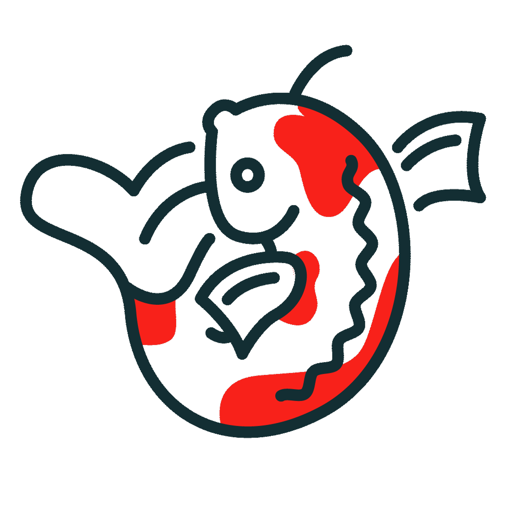
- A clever name: The name is a playful pun. "Wag" refers to the happy tail of an animal, while "Whisk" doubles as a pet's whisker and the kitchen tool.
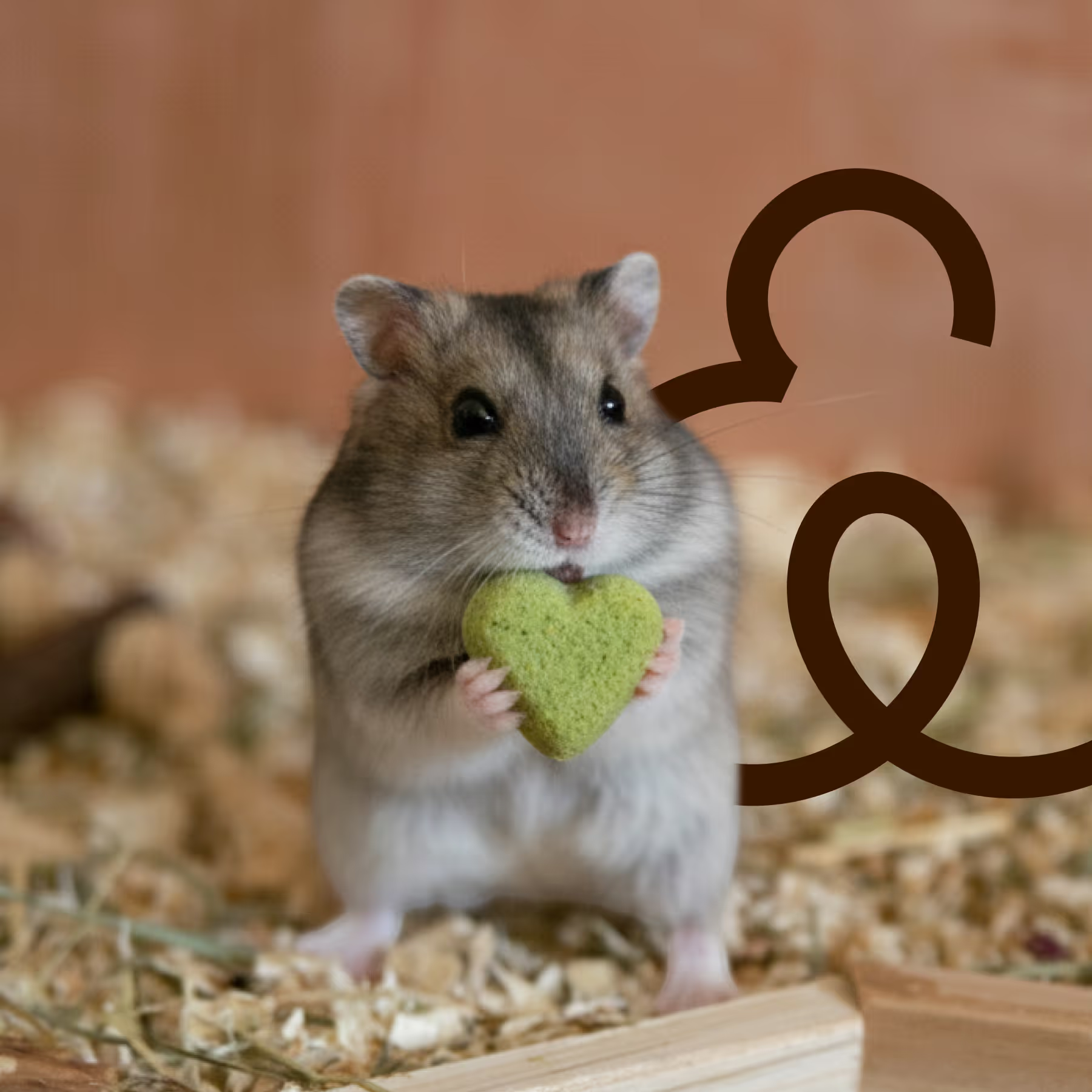
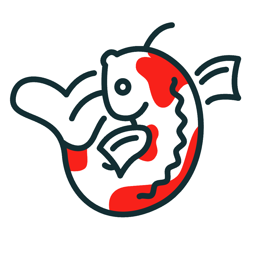
- The smile logo: At the center of the brand is a custom-designed ampersand (&). I shaped it to look like a pet’s happy smile, subtly reminding the customer of the joy their pet feels when they get a treat.
- High-energy colours: We used a bold, energetic palette of yellow, orange, and pink. These colors signal happiness and energy, proving that healthy doesn't have to look boring.
- Modern typography: We paired a playful serif font for headings with a clean sans-serif for body text. This creates a trustworthy yet modern look.
- Playful copywriting: We moved away from corporate talk and used language pet owners actually use. Because treat-giving is an emotional experience, we focused on fun nicknames and "punny" descriptions.
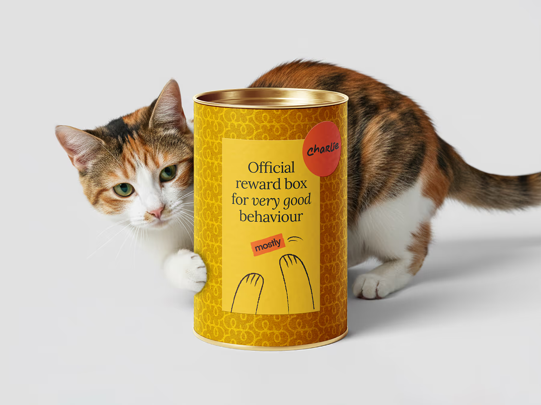
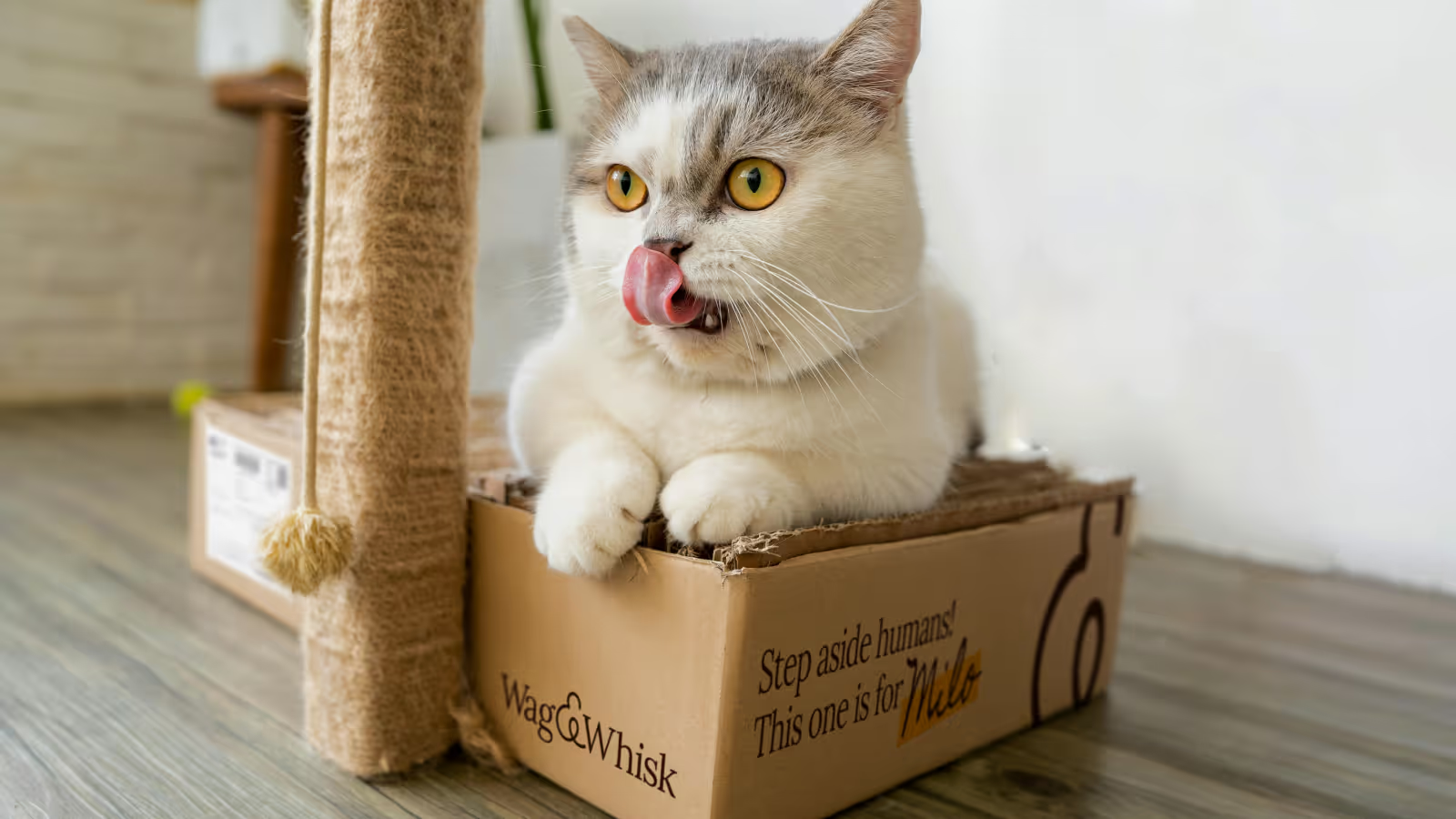
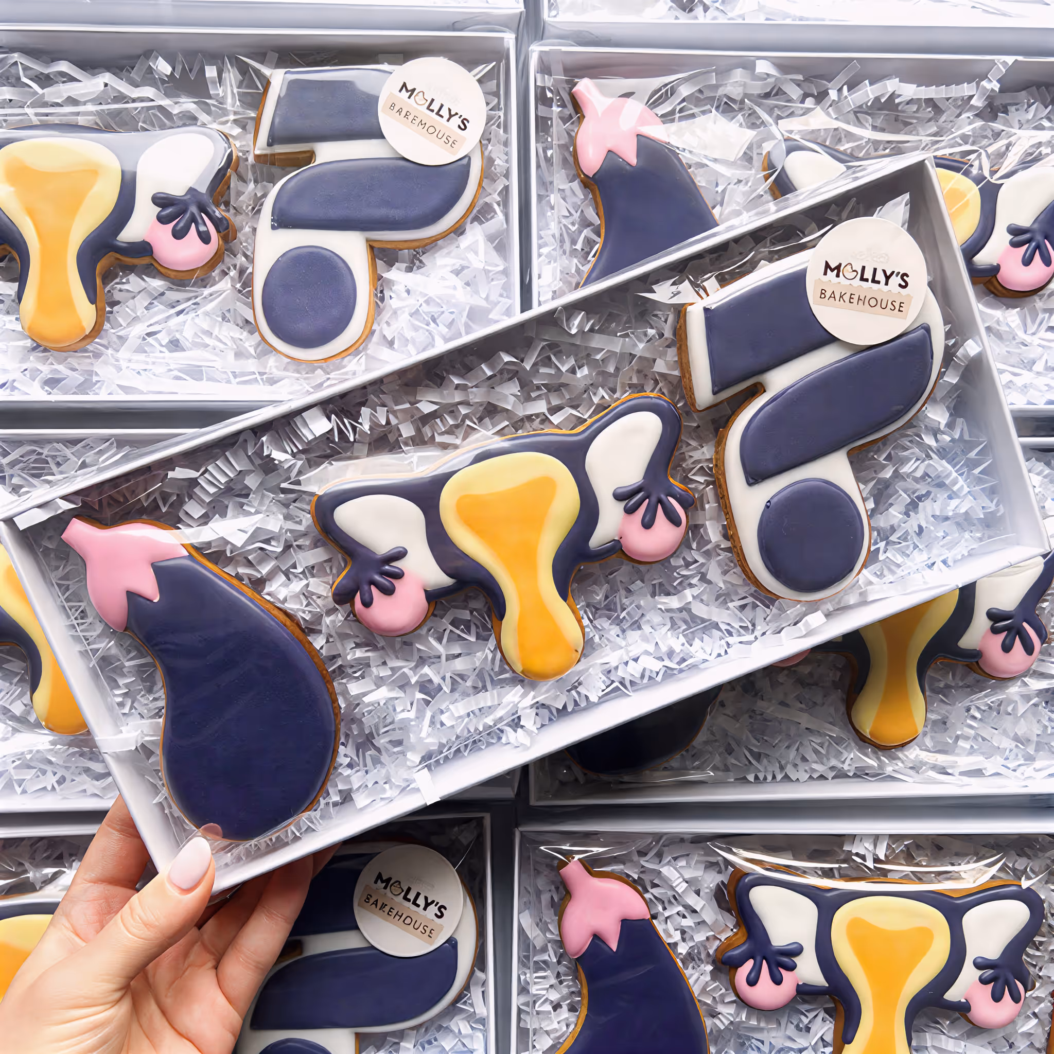
- A personalised experience: We wanted the unboxing moment to be as special for the owner as the treat is for the pet. Every delivery box features the pet’s name handwritten on the outside, making it feel like a gift rather than just an order. We also include a set of custom stickers where owners can write their pet’s name to label their treat jars at home, allowing the pet parents to participate in the brand experience.
The result is a brand that stands out on the digital and physical world, and celebrates the bond between humans and their best friends, proving that safety and fun can live in the same bowl.


Sweet dreams are made of these case studies
Dive into the projects where strategy meets design to solve real business challenges.
See all case studies


"Her designs consistently deliver results and integrate into the overall business strategy."

Like what you see?
Let’s spend 30 minutes discussing your goals and see how we can bring your vision to life.
Work with meDream Retainer
Dream Project
Why Meika
Portfolio
Privacy policy
Accessibility
Brand and website by Meika. Built from scratch, because dreams don't come in templates ;)
Meika
First Floor, Swan Buildings
20 Swan Street
Manchester
M4 5JW